React Labs: View Transitions, Activity, and more
April 23, 2025 by Ricky Hanlon
In React Labs posts, we write about projects in active research and development. In this post, we’re sharing two new experimental features that are ready to try today, and updates on other areas we’re working on now.
Today, we’re excited to release documentation for two new experimental features that are ready for testing:
We’re also sharing updates on new features currently in development:
- React Performance Tracks
- Compiler IDE Extension
- Automatic Effect Dependencies
- Fragment Refs
- Concurrent Stores
New Experimental Features
View Transitions and Activity are now ready for testing in react@experimental. These features have been tested in production and are stable, but the final API may still change as we incorporate feedback.
You can try them by upgrading React packages to the most recent experimental version:
react@experimentalreact-dom@experimental
Read on to learn how to use these features in your app, or check out the newly published docs:
<ViewTransition>: A component that lets you activate an animation for a Transition.addTransitionType: A function that allows you to specify the cause of a Transition.<Activity>: A component that lets you hide and show parts of the UI.
View Transitions
React View Transitions are a new experimental feature that makes it easier to add animations to UI transitions in your app. Under-the-hood, these animations use the new startViewTransition API available in most modern browsers.
To opt-in to animating an element, wrap it in the new <ViewTransition> component:
// "what" to animate.
<ViewTransition>
  <div>animate me</div>
</ViewTransition>
This new component lets you declaratively define “what” to animate when an animation is activated.
You can define “when” to animate by using one of these three triggers for a View Transition:
// "when" to animate.

// Transitions
startTransition(() => setState(...));

// Deferred Values
const deferred = useDeferredValue(value);

// Suspense
<Suspense fallback={<Fallback />}>
  <div>Loading...</div>
</Suspense>
By default, these animations use the default CSS animations for View Transitions applied (typically a smooth cross-fade). You can use view transition pseudo-selectors to define “how” the animation runs. For example, you can use * to change the default animation for all transitions:
// "how" to animate.
::view-transition-old(*) {
  animation: 300ms ease-out fade-out;
}
::view-transition-new(*) {
  animation: 300ms ease-in fade-in;
}
When the DOM updates due to an animation trigger—like startTransition, useDeferredValue, or a Suspense fallback switching to content—React will use declarative heuristics to automatically determine which <ViewTransition> components to activate for the animation. The browser will then run the animation that’s defined in CSS.
If you’re familiar with the browser’s View Transition API and want to know how React supports it, check out How does <ViewTransition> Work in the docs.
In this post, let’s take a look at a few examples of how to use View Transitions.
We’ll start with this app, which doesn’t animate any of the following interactions:
- Click a video to view the details.
- Click “back” to go back to the feed.
- Type in the list to filter the videos.
import TalkDetails from './Details'; import Home from './Home'; import {useRouter} from './router';

export default function App() {
  const {url} = useRouter();

  // 🚩This version doesn't include any animations yet
  return url === '/' ? <Home /> : <TalkDetails />;
}
Animating navigations
Our app includes a Suspense-enabled router, with page transitions already marked as Transitions, which means navigations are performed with startTransition:
function navigate(url) {
  startTransition(() => {
    go(url);
  });
}
startTransition is a View Transition trigger, so we can add <ViewTransition> to animate between pages:
// "what" to animate
<ViewTransition key={url}>
  {url === '/' ? <Home /> : <TalkDetails />}
</ViewTransition>
When the url changes, the <ViewTransition> and new route are rendered. Since the <ViewTransition> was updated inside of startTransition, the <ViewTransition> is activated for an animation.
By default, View Transitions include the browser default cross-fade animation. Adding this to our example, we now have a cross-fade whenever we navigate between pages:
import {ViewTransition} from 'react'; import Details from './Details';
import Home from './Home'; import {useRouter} from './router';

export default function App() {
  const {url} = useRouter();

  // Use ViewTransition to animate between pages.
  // No additional CSS needed by default.
  return (
    <ViewTransition>
      {url === '/' ? <Home /> : <Details />}
    </ViewTransition>
  );
}
Since our router already updates the route using startTransition, this one line change to add <ViewTransition> activates with the default cross-fade animation.
If you’re curious how this works, see the docs for How does <ViewTransition> work?
Customizing animations
By default, <ViewTransition> includes the default cross-fade from the browser.
To customize animations, you can provide props to the <ViewTransition> component to specify which animations to use, based on how the <ViewTransition> activates.
For example, we can slow down the default cross fade animation:
<ViewTransition default="slow-fade">
  <Home />
</ViewTransition>
And define slow-fade in CSS using view transition classes:
::view-transition-old(.slow-fade) {
    animation-duration: 500ms;
}

::view-transition-new(.slow-fade) {
    animation-duration: 500ms;
}
Now, the cross fade is slower:
import { ViewTransition } from "react";
import Details from "./Details";
import Home from "./Home";
import { useRouter } from "./router";

export default function App() {
  const { url } = useRouter();

  // Define a default animation of .slow-fade.
  // See animations.css for the animation definition.
  return (
    <ViewTransition default="slow-fade">
      {url === '/' ? <Home /> : <Details />}
    </ViewTransition>
  );
}
See Styling View Transitions for a full guide on styling <ViewTransition>.
Shared Element Transitions
When two pages include the same element, often you want to animate it from one page to the next.
To do this you can add a unique name to the <ViewTransition>:
<ViewTransition name={`video-${video.id}`}>
  <Thumbnail video={video} />
</ViewTransition>
Now the video thumbnail animates between the two pages:
import { useState, ViewTransition } from "react"; import LikeButton from "./LikeButton"; import { useRouter } from "./router"; import { PauseIcon, PlayIcon } from "./Icons"; import { startTransition } from "react";

export function Thumbnail({ video, children }) {
  // Add a name to animate with a shared element transition.
  // This uses the default animation, no additional css needed.
  return (
    <ViewTransition name={`video-${video.id}`}>
      <div
        aria-hidden="true"
        tabIndex={-1}
        className={`thumbnail ${video.image}`}
      >
        {children}
      </div>
    </ViewTransition>
  );
}

export function VideoControls() {
  const [isPlaying, setIsPlaying] = useState(false);

  return (
    <span
      className="controls"
      onClick={() =>
        startTransition(() => {
          setIsPlaying((p) => !p);
        })
      }
    >
      {isPlaying ? <PauseIcon /> : <PlayIcon />}
    </span>
  );
}

export function Video({ video }) {
  const { navigate } = useRouter();

  return (
    <div className="video">
      <div
        className="link"
        onClick={(e) => {
          e.preventDefault();
          navigate(`/video/${video.id}`);
        }}
      >
        <Thumbnail video={video}></Thumbnail>

        <div className="info">
          <div className="video-title">{video.title}</div>
          <div className="video-description">{video.description}</div>
        </div>
      </div>
      <LikeButton video={video} />
    </div>
  );
}
By default, React automatically generates a unique name for each element activated for a transition (see How does <ViewTransition> work). When React sees a transition where a <ViewTransition> with a name is removed and a new <ViewTransition> with the same name is added, it will activate a shared element transition.
For more info, see the docs for Animating a Shared Element.
Animating based on cause
Sometimes, you may want elements to animate differently based on how it was triggered. For this use case, we’ve added a new API called addTransitionType to specify the cause of a transition:
function navigate(url) {
  startTransition(() => {
    // Transition type for the cause "nav forward"
    addTransitionType('nav-forward');
    go(url);
  });
}
function navigateBack(url) {
  startTransition(() => {
    // Transition type for the cause "nav backward"
    addTransitionType('nav-back');
    go(url);
  });
}
With transition types, you can provide custom animations via props to <ViewTransition>. Let’s add a shared element transition to the header for “6 Videos” and “Back”:
<ViewTransition
  name="nav"
  share={{
    'nav-forward': 'slide-forward',
    'nav-back': 'slide-back',
  }}>
  {heading}
</ViewTransition>
Here we pass a share prop to define how to animate based on the transition type. When the share transition activates from nav-forward, the view transition class slide-forward is applied. When it’s from nav-back, the slide-back animation is activated. Let’s define these animations in CSS:
::view-transition-old(.slide-forward) {
    /* when sliding forward, the "old" page should slide out to left. */
    animation: ...
}

::view-transition-new(.slide-forward) {
    /* when sliding forward, the "new" page should slide in from right. */
    animation: ...
}

::view-transition-old(.slide-back) {
    /* when sliding back, the "old" page should slide out to right. */
    animation: ...
}

::view-transition-new(.slide-back) {
    /* when sliding back, the "new" page should slide in from left. */
    animation: ...
}
Now we can animate the header along with thumbnail based on navigation type:
import {ViewTransition} from 'react'; import { useIsNavPending } from "./router";

export default function Page({ heading, children }) {
  const isPending = useIsNavPending();
  return (
    <div className="page">
      <div className="top">
        <div className="top-nav">
          {/* Custom classes based on transition type. */}
          <ViewTransition
            name="nav"
            share={{
              'nav-forward': 'slide-forward',
              'nav-back': 'slide-back',
            }}>
            {heading}
          </ViewTransition>
          {isPending && <span className="loader"></span>}
        </div>
      </div>
      {/* Opt-out of ViewTransition for the content. */}
      {/* Content can define it's own ViewTransition. */}
      <ViewTransition default="none">
        <div className="bottom">
          <div className="content">{children}</div>
        </div>
      </ViewTransition>
    </div>
  );
}
Animating Suspense Boundaries
Suspense will also activate View Transitions.
To animate the fallback to content, we can wrap Suspense with <ViewTranstion>:
<ViewTransition>
  <Suspense fallback={<VideoInfoFallback />}>
    <VideoInfo />
  </Suspense>
</ViewTransition>
By adding this, the fallback will cross-fade into the content. Click a video and see the video info animate in:
import { use, Suspense, ViewTransition } from "react"; import { fetchVideo, fetchVideoDetails } from "./data"; import { Thumbnail, VideoControls } from "./Videos"; import { useRouter } from "./router"; import Layout from "./Layout"; import { ChevronLeft } from "./Icons";

function VideoDetails({ id }) {
  // Cross-fade the fallback to content.
  return (
    <ViewTransition default="slow-fade">
      <Suspense fallback={<VideoInfoFallback />}>
          <VideoInfo id={id} />
      </Suspense>
    </ViewTransition>
  );
}

function VideoInfoFallback() {
  return (
    <div>
      <div className="fit fallback title"></div>
      <div className="fit fallback description"></div>
    </div>
  );
}

export default function Details() {
  const { url, navigateBack } = useRouter();
  const videoId = url.split("/").pop();
  const video = use(fetchVideo(videoId));

  return (
    <Layout
      heading={
        <div
          className="fit back"
          onClick={() => {
            navigateBack("/");
          }}
        >
          <ChevronLeft /> Back
        </div>
      }
    >
      <div className="details">
        <Thumbnail video={video} large>
          <VideoControls />
        </Thumbnail>
        <VideoDetails id={video.id} />
      </div>
    </Layout>
  );
}

function VideoInfo({ id }) {
  const details = use(fetchVideoDetails(id));
  return (
    <div>
      <p className="fit info-title">{details.title}</p>
      <p className="fit info-description">{details.description}</p>
    </div>
  );
}
We can also provide custom animations using an exit on the fallback, and enter on the content:
<Suspense
  fallback={
    <ViewTransition exit="slide-down">
      <VideoInfoFallback />
    </ViewTransition>
  }
>
  <ViewTransition enter="slide-up">
    <VideoInfo id={id} />
  </ViewTransition>
</Suspense>
Here’s how we’ll define slide-down and slide-up with CSS:
::view-transition-old(.slide-down) {
  /* Slide the fallback down */
  animation: ...;
}

::view-transition-new(.slide-up) {
  /* Slide the content up */
  animation: ...;
}
Now, the Suspense content replaces the fallback with a sliding animation:
import { use, Suspense, ViewTransition } from "react"; import { fetchVideo, fetchVideoDetails } from "./data"; import { Thumbnail, VideoControls } from "./Videos"; import { useRouter } from "./router"; import Layout from "./Layout"; import { ChevronLeft } from "./Icons";

function VideoDetails({ id }) {
  return (
    <Suspense
      fallback={
        // Animate the fallback down.
        <ViewTransition exit="slide-down">
          <VideoInfoFallback />
        </ViewTransition>
      }
    >
      {/* Animate the content up */}
      <ViewTransition enter="slide-up">
        <VideoInfo id={id} />
      </ViewTransition>
    </Suspense>
  );
}

function VideoInfoFallback() {
  return (
    <>
      <div className="fallback title"></div>
      <div className="fallback description"></div>
    </>
  );
}

export default function Details() {
  const { url, navigateBack } = useRouter();
  const videoId = url.split("/").pop();
  const video = use(fetchVideo(videoId));

  return (
    <Layout
      heading={
        <div
          className="fit back"
          onClick={() => {
            navigateBack("/");
          }}
        >
          <ChevronLeft /> Back
        </div>
      }
    >
      <div className="details">
        <Thumbnail video={video} large>
          <VideoControls />
        </Thumbnail>
        <VideoDetails id={video.id} />
      </div>
    </Layout>
  );
}

function VideoInfo({ id }) {
  const details = use(fetchVideoDetails(id));
  return (
    <>
      <p className="info-title">{details.title}</p>
      <p className="info-description">{details.description}</p>
    </>
  );
}
Animating Lists
You can also use <ViewTransition> to animate lists of items as they re-order, like in a searchable list of items:
<div className="videos">
  {filteredVideos.map((video) => (
    <ViewTransition key={video.id}>
      <Video video={video} />
    </ViewTransition>
  ))}
</div>
To activate the ViewTransition, we can use useDeferredValue:
const [searchText, setSearchText] = useState('');
const deferredSearchText = useDeferredValue(searchText);
const filteredVideos = filterVideos(videos, deferredSearchText);
Now the items animate as you type in the search bar:
import { useId, useState, use, useDeferredValue, ViewTransition } from "react";import { Video } from "./Videos";import Layout from "./Layout";import { fetchVideos } from "./data";import { IconSearch } from "./Icons";

function SearchList({searchText, videos}) {
  // Activate with useDeferredValue ("when")
  const deferredSearchText = useDeferredValue(searchText);
  const filteredVideos = filterVideos(videos, deferredSearchText);
  return (
    <div className="video-list">
      <div className="videos">
        {filteredVideos.map((video) => (
          // Animate each item in list ("what")
          <ViewTransition key={video.id}>
            <Video video={video} />
          </ViewTransition>
        ))}
      </div>
      {filteredVideos.length === 0 && (
        <div className="no-results">No results</div>
      )}
    </div>
  );
}

export default function Home() {
  const videos = use(fetchVideos());
  const count = videos.length;
  const [searchText, setSearchText] = useState('');

  return (
    <Layout heading={<div className="fit">{count} Videos</div>}>
      <SearchInput value={searchText} onChange={setSearchText} />
      <SearchList videos={videos} searchText={searchText} />
    </Layout>
  );
}

function SearchInput({ value, onChange }) {
  const id = useId();
  return (
    <form className="search" onSubmit={(e) => e.preventDefault()}>
      <label htmlFor={id} className="sr-only">
        Search
      </label>
      <div className="search-input">
        <div className="search-icon">
          <IconSearch />
        </div>
        <input
          type="text"
          id={id}
          placeholder="Search"
          value={value}
          onChange={(e) => onChange(e.target.value)}
        />
      </div>
    </form>
  );
}

function filterVideos(videos, query) {
  const keywords = query
    .toLowerCase()
    .split(" ")
    .filter((s) => s !== "");
  if (keywords.length === 0) {
    return videos;
  }
  return videos.filter((video) => {
    const words = (video.title + " " + video.description)
      .toLowerCase()
      .split(" ");
    return keywords.every((kw) => words.some((w) => w.includes(kw)));
  });
}
Final result
By adding a few <ViewTransition> components and a few lines of CSS, we were able to add all the animations above into the final result.
We’re excited about View Transitions and think they will level up the apps you’re able to build. They’re ready to start trying today in the experimental channel of React releases.
Let’s remove the slow fade, and take a look at the final result:
import {ViewTransition} from 'react'; import Details from './Details'; import Home from './Home'; import {useRouter} from './router';

export default function App() {
  const {url} = useRouter();

  // Animate with a cross fade between pages.
  return (
    <ViewTransition key={url}>
      {url === '/' ? <Home /> : <Details />}
    </ViewTransition>
  );
}
If you’re curious to know more about how they work, check out How Does <ViewTransition> Work in the docs.
For more background on how we built View Transitions, see: #31975, #32105, #32041, #32734, #32797 #31999, #32031, #32050, #32820, #32029, #32028, and #32038 by @sebmarkbage (thanks Seb!).
Activity
In past updates, we shared that we were researching an API to allow components to be visually hidden and deprioritized, preserving UI state with reduced performance costs relative to unmounting or hiding with CSS.
We’re now ready to share the API and how it works, so you can start testing it in experimental React versions.
<Activity> is a new component to hide and show parts of the UI:
<Activity mode={isVisible ? 'visible' : 'hidden'}>
  <Page />
</Activity>
When an Activity is visible it’s rendered as normal. When an Activity is hidden it is unmounted, but will save its state and continue to render at a lower priority than anything visible on screen.
You can use Activity to save state for parts of the UI the user isn’t using, or pre-render parts that a user is likely to use next.
Let’s look at some examples improving the View Transition examples above.
Restoring state with Activity
When a user navigates away from a page, it’s common to stop rendering the old page:
function App() {
  const { url } = useRouter();

  return (
    <>
      {url === '/' && <Home />}
      {url !== '/' && <Details />}
    </>
  );
}
However, this means if the user goes back to the old page, all of the previous state is lost. For example, if the <Home /> page has an <input> field, when the user leaves the page the <input> is unmounted, and all of the text they had typed is lost.
Activity allows you to keep the state around as the user changes pages, so when they come back they can resume where they left off. This is done by wrapping part of the tree in <Activity> and toggling the mode:
function App() {
  const { url } = useRouter();

  return (
    <>
      <Activity mode={url === '/' ? 'visible' : 'hidden'}>
        <Home />
      </Activity>
      {url !== '/' && <Details />}
    </>
  );
}
With this change, we can improve on our View Transitions example above. Before, when you searched for a video, selected one, and returned, your search filter was lost. With Activity, your search filter is restored and you can pick up where you left off.
Try searching for a video, selecting it, and clicking “back”:
import { Activity, ViewTransition } from "react"; import Details from "./Details"; import Home from "./Home"; import { useRouter } from "./router";

export default function App() {
  const { url } = useRouter();

  return (
    // View Transitions know about Activity
    <ViewTransition>
      {/* Render Home in Activity so we don't lose state */}
      <Activity mode={url === '/' ? 'visible' : 'hidden'}>
        <Home />
      </Activity>
      {url !== '/' && <Details />}
    </ViewTransition>
  );
}
Pre-rendering with Activity
Sometimes, you may want to prepare the next part of the UI a user is likely to use ahead of time, so it’s ready by the time they are ready to use it. This is especially useful if the next route needs to suspend on data it needs to render, because you can help ensure the data is already fetched before the user navigates.
For example, our app currently needs to suspend to load the data for each video when you select one. We can improve this by rendering all of the pages in a hidden <Activity> until the user navigates:
<ViewTransition>
  <Activity mode={url === '/' ? 'visible' : 'hidden'}>
    <Home />
  </Activity>
  <Activity mode={url === '/details/1' ? 'visible' : 'hidden'}>
    <Details id={id} />
  </Activity>
  <Activity mode={url === '/details/1' ? 'visible' : 'hidden'}>
    <Details id={id} />
  </Activity>
<ViewTransition>
With this update, if the content on the next page has time to pre-render, it will animate in without the Suspense fallback. Click a video, and notice that the video title and description on the Details page render immediately, without a fallback:
import { Activity, ViewTransition, use } from "react"; import Details from "./Details"; import Home from "./Home"; import { useRouter } from "./router"; import {fetchVideos} from './data';

export default function App() {
  const { url } = useRouter();
  const videoId = url.split("/").pop();
  const videos = use(fetchVideos());

  return (
    <ViewTransition>
      {/* Render videos in Activity to pre-render them */}
      {videos.map(({id}) => (
        <Activity key={id} mode={videoId === id ? 'visible' : 'hidden'}>
          <Details id={id}/>
        </Activity>
      ))}
      <Activity mode={url === '/' ? 'visible' : 'hidden'}>
        <Home />
      </Activity>
    </ViewTransition>
  );
}
Server-Side Rendering with Activity
When using Activity on a page that uses server-side rendering (SSR), there are additional optimizations.
If part of the page is rendered with mode="hidden", then it will not be included in the SSR response. Instead, React will schedule a client render for the content inside Activity while the rest of the page hydrates, prioritizing the visible content on screen.
For parts of the UI rendered with mode="visible", React will de-prioritize hydration of content within Activity, similar to how Suspense content is hydrated at a lower priority. If the user interacts with the page, we’ll prioritize hydration within the boundary if needed.
These are advanced use cases, but they show the additional benefits considered with Activity.
Future modes for Activity
In the future, we may add more modes to Activity.
For example, a common use case is rendering a modal, where the previous “inactive” page is visible behind the “active” modal view. The “hidden” mode does not work for this use case because it’s not visible and not included in SSR.
Instead, we’re considering a new mode that would keep the content visible—and included in SSR—but keep it unmounted and de-prioritize updates. This mode may also need to “pause” DOM updates, since it can be distracting to see backgrounded content updating while a modal is open.
Another mode we’re considering for Activity is the ability to automatically destroy state for hidden Activities if there is too much memory being used. Since the component is already unmounted, it may be preferable to destroy state for the least recently used hidden parts of the app rather than consume too many resources.
These are areas we’re still exploring, and we’ll share more as we make progress. For more information on what Activity includes today, check out the docs.
Features in development
We’re also developing features to help solve the common problems below.
As we iterate on possible solutions, you may see some potential APIs we’re testing being shared based on the PRs we are landing. Please keep in mind that as we try different ideas, we often change or remove different solutions after trying them out.
When the solutions we’re working on are shared too early, it can create churn and confusion in the community. To balance being transparent and limiting confusion, we’re sharing the problems we’re currently developing solutions for, without sharing a particular solution we have in mind.
As these features progress, we’ll announce them on the blog with docs included so you can try them out.
React Performance Tracks
We’re working on a new set of custom tracks to performance profilers using browser APIs that allow adding custom tracks to provide more information about the performance of your React app.
This feature is still in progress, so we’re not ready to publish docs to fully release it as an experimental feature yet. You can get a sneak preview when using an experimental version of React, which will automatically add the performance tracks to profiles:
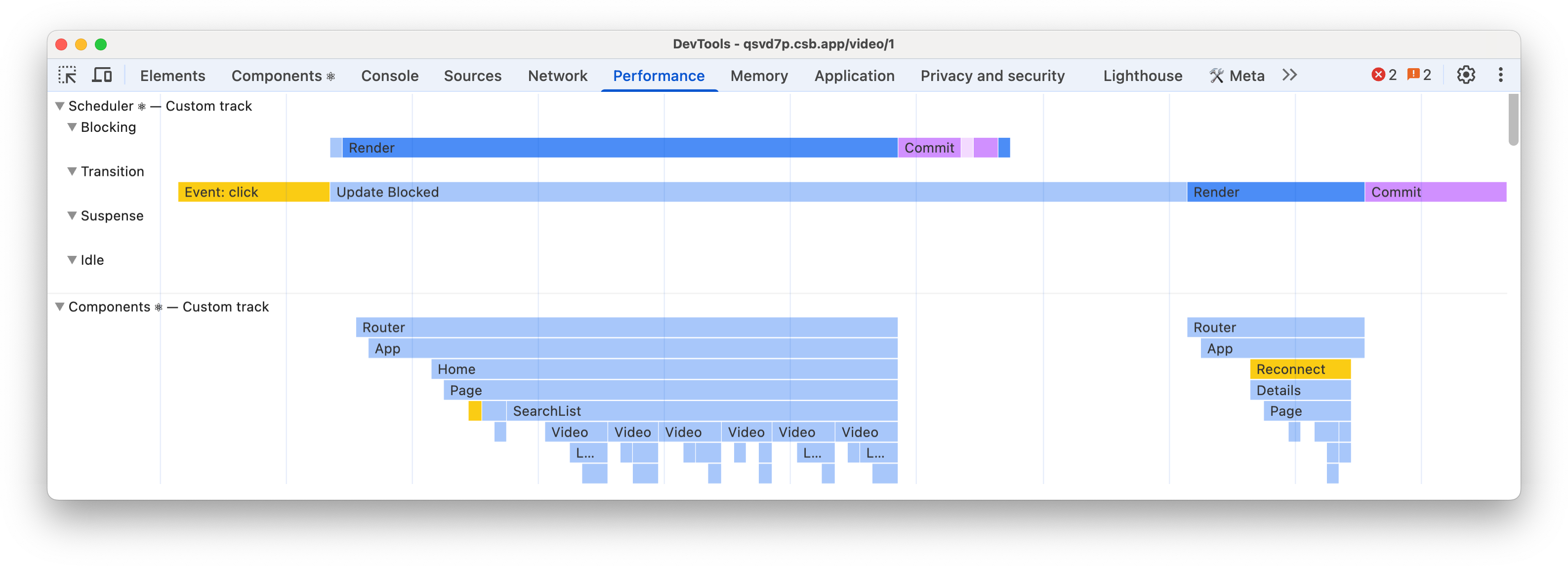
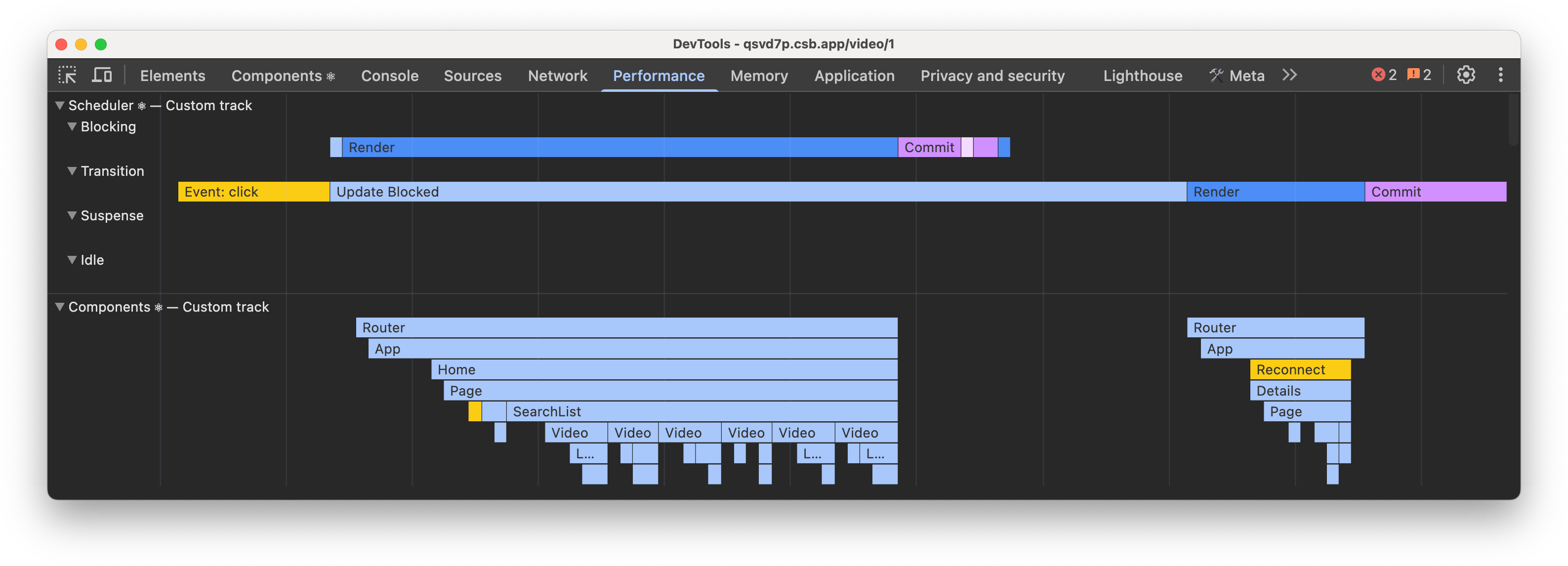
There are a few known issues we plan to address such as performance, and the scheduler track not always “connecting” work across Suspended trees, so it’s not quite ready to try. We’re also still collecting feedback from early adopters to improve the design and usability of the tracks.
Once we solve those issues, we’ll publish experimental docs and share that it’s ready to try.
Automatic Effect Dependencies
When we released hooks, we had three motivations:
- Sharing code between components: hooks replaced patterns like render props and higher-order components to allow you to reuse stateful logic without changing your component hierarchy.
- Think in terms of function, not lifecycles: hooks let you split one component into smaller functions based on what pieces are related (such as setting up a subscription or fetching data), rather than forcing a split based on lifecycle methods.
- Support ahead-of-time compilation: hooks were designed to support ahead-of-time compilation with less pitfalls causing unintentional de-optimizations caused by lifecycle methods, and limitations of classes.
Since their release, hooks have been successful at sharing code between components. Hooks are now the favored way to share logic between components, and there are less use cases for render props and higher order components. Hooks have also been successful at supporting features like Fast Refresh that were not possible with class components.
Effects can be hard
Unfortunately, some hooks are still hard to think in terms of function instead of lifecycles. Effects specifically are still hard to understand and are the most common pain point we hear from developers. Last year, we spent a significant amount of time researching how Effects were used, and how those use cases could be simplified and easier to understand.
We found that often, the confusion is from using an Effect when you don’t need to. The You Might Not Need an Effect guide covers many cases for when Effects are not the right solution. However, even when an Effect is the right fit for a problem, Effects can still be harder to understand than class component lifecycles.
We believe one of the reasons for confusion is that developers to think of Effects from the component’s perspective (like a lifecycle), instead of the Effects point of view (what the Effect does).
Let’s look at an example from the docs:
useEffect(() => {
  // Your Effect connected to the room specified with roomId...
  const connection = createConnection(serverUrl, roomId);
  connection.connect();
  return () => {
    // ...until it disconnected
    connection.disconnect();
  };
}, [roomId]);
Many users would read this code as “on mount, connect to the roomId. whenever roomId changes, disconnect to the old room and re-create the connection”. However, this is thinking from the component’s lifecycle perspective, which means you will need to think of every component lifecycle state to write the Effect correctly. This can be difficult, so it’s understandable that Effects seem harder than class lifecycles when using the component perspective.
Effects without dependencies
Instead, it’s better to think from the Effect’s perspective. The Effect doesn’t know about the component lifecycles. It only describes how to start synchronization and how to stop it. When users think of Effects in this way, their Effects tend to be easier to write, and more resilient to being started and stopped as many times as is needed.
We spent some time researching why Effects are thought of from the component perspective, and we think one of the reasons is the dependency array. Since you have to write it, it’s right there and in your face reminding you of what you’re “reacting” to and baiting you into the mental model of ‘do this when these values change’.
When we released hooks, we knew we could make them easier to use with ahead-of-time compilation. With the React Compiler, you’re now able to avoid writing useCallback and useMemo yourself in most cases. For Effects, the compiler can insert the dependencies for you:
useEffect(() => {
  const connection = createConnection(serverUrl, roomId);
  connection.connect();
  return () => {
    connection.disconnect();
  };
}); // compiler inserted dependencies.
With this code, the React Compiler can infer the dependencies for you and insert them automatically so you don’t need to see or write them. With features like the IDE extension and useEffectEvent, we can provide a CodeLens to show you what the Compiler inserted for times you need to debug, or to optimize by removing a dependency. This helps reinforce the correct mental model for writing Effects, which can run at any time to synchronize your component or hook’s state with something else.
Our hope is that automatically inserting dependencies is not only easier to write, but that it also makes them easier to understand by forcing you to think in terms of what the Effect does, and not in component lifecycles.
Compiler IDE Extension
Later in 2025 we shared the first stable release of React Compiler, and we’re continuing to invest in shipping more improvements.
We’ve also begun exploring ways to use the React Compiler to provide information that can improve understanding and debugging your code. One idea we’ve started exploring is a new experimental LSP-based React IDE extension powered by React Compiler, similar to the extension used in Lauren Tan’s React Conf talk.
Our idea is that we can use the compiler’s static analysis to provide more information, suggestions, and optimization opportunities directly in your IDE. For example, we can provide diagnostics for code breaking the Rules of React, hovers to show if components and hooks were optimized by the compiler, or a CodeLens to see automatically inserted Effect dependencies.
The IDE extension is still an early exploration, but we’ll share our progress in future updates.
Fragment Refs
Many DOM APIs like those for event management, positioning, and focus are difficult to compose when writing with React. This often leads developers to reach for Effects, managing multiple Refs, by using APIs like findDOMNode (removed in React 19).
We are exploring adding refs to Fragments that would point to a group of DOM elements, rather than just a single element. Our hope is that this will simplify managing multiple children and make it easier to write composable React code when calling DOM APIs.
Fragment refs are still being researched. We’ll share more when we’re closer to having the final API finished.
Gesture Animations
We’re also researching ways to enhance View Transitions to support gesture animations such as swiping to open a menu, or scroll through a photo carousel.
Gestures present new challenges for a few reasons:
- Gestures are continuous: as you swipe the animation is tied to your finger placement time, rather than triggering and running to completion.
- Gestures don’t complete: when you release your finger gesture animations can run to completion, or revert to their original state (like when you only partially open a menu) depending on how far you go.
- Gestures invert old and new: while you’re animating, you want the page you are animating from to stay “alive” and interactive. This inverts the browser View Transition model where the “old” state is a snapshot and the “new” state is the live DOM.
We believe we’ve found an approach that works well and may introduce a new API for triggering gesture transitions. For now, we’re focused on shipping <ViewTransition>, and will revisit gestures afterward.
Concurrent Stores
When we released React 18 with concurrent rendering, we also released useSyncExternalStore so external store libraries that did not use React state or context could support concurrent rendering by forcing a synchronous render when the store is updated.
Using useSyncExternalStore comes at a cost though, since it forces a bail out from concurrent features like transitions, and forces existing content to show Suspense fallbacks.
Now that React 19 has shipped, we’re revisiting this problem space to create a primitive to fully support concurrent external stores with the use API:
const value = use(store);Our goal is to allow external state to be read during render without tearing, and to work seamlessly with all of the concurrent features React offers.
This research is still early. We’ll share more, and what the new APIs will look like, when we’re further along.
Thanks to Aurora Scharff, Dan Abramov, Eli White, Lauren Tan, Luna Wei, Matt Carroll, Jack Pope, Jason Bonta, Jordan Brown, Jordan Eldredge, Mofei Zhang, Sebastien Lorber, Sebastian Markbåge, and Tim Yung for reviewing this post.